Module 2 · Your Logo, Part 1: Find "The One"
The variation loop: closing in on "the one"
This is the heart of the whole method: take the one concept you almost love, feed it back, and ask for variations. Pick the best. Feed that one back. Ask again. Each loop closes in — variations of variations — until a mark shows up that just feels right. Three to six loops is normal. You’ll feel it click.
The variation prompt
Attach the cropped single concept you saved last lesson (on Windows, paste with Ctrl + V; or drag the file into the message box). Then send this:
Copy this into ChatGPT
Here is the logo direction I like. Keep this same core idea and overall style,
but create ONE image showing 6 refined VARIATIONS of it — vary the proportions,
spacing, weight, and small details, not the underlying concept.
Flat vector style, plain white background. Keep any text spelled "[BUSINESS NAME]".
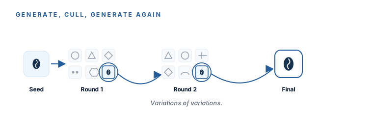
When the six come back, pick the best one, screenshot it (crop tight, same as before), feed it back in, and ask for six more variations of that one. Round after round, the differences get smaller and the mark gets closer to right.
The reliability rule: one change, and name what to keep
Once you’re close and just nudging details, switch from “six variations” to surgical single changes. The rule every good guide repeats: change one thing per prompt, and tell it what to keep. Like this:
Copy this into ChatGPT
Same logo, one change only: make the mark a bit simpler and the icon slightly bolder
so it stays legible at very small sizes. Don't change the colors or the layout.
Naming what to keep (“don’t change the colors or the layout”) is what stops the model from “improving” things you were happy with.
Three snags, and the fix for each
Re-upload the cropped mark every round. Don’t rely on the chat to “remember” the look — give it the picture again each time and say “keep this same core idea and style, change only [X].” Feeding the actual image back is what holds the line.
That’s over-editing. The cure is the rule above: one change per prompt, and name the keeps. Ask for the mark to be simpler and the color changed andthe text tweaked in one go, and you’ll get a different logo. Ask for one thing, and you’ll get that one thing.
Stop fighting it. Go with an icon mark now and add your business name in a real font in Module 5 — that’s the professional way anyway. If the name truly must sit inside the logo, generate that version in Ideogram, which is built to spell words correctly.
How many loops is normal?
Three to six. Some brands land in two, some take eight. Don’t count — watch the marks. When a round comes back and you catch yourself thinking “that’s it,” that’s it. Save a tight crop of your near-final mark; the next lesson puts it through a blunt critique before you commit.
A single, near-final logo mark you’re genuinely pleased with — arrived at by narrowing, one round at a time. It doesn’t have to be perfect yet. It has to be close enough to critique.
Watch this step
A working graphic designer walks the prompt-and-refine loop — feed it back, ask for variations, close in — so you can watch the "iterate to the one" habit modeled with a professional eye. It’s from an independent creator — credited below, so go give them a follow.
How To Use ChatGPT for Logo Design: Step-by-Step Tutorial
More learning resources
Still want another angle? These are hand-picked and vetted to line up with this lesson — from creators and sites worth your time.