
Module 5 · Fonts That Look Chosen, Not Defaulted
Font literacy in ten minutes
Nothing screams “made in a hurry” like default fonts. Nothing quietly says “this person is serious” like two fonts that clearly belong together. The gap between those two looks is one rule and about ten minutes — no design degree required.
The tiny vocabulary you actually need
You need four words, and then you can stop:
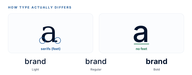
- Serif — letters with little feet on the ends (like Times). Reads classic, editorial, trustworthy.
- Sans-serif — no feet, clean lines (like Arial). Reads modern, plain, no-nonsense. (“Sans” is French for “without.”)
- Display — a font with personality, built for big headlines, not paragraphs.
- Weight — how thick the strokes are: Light, Regular, Bold. Same font, different volume.
The one rule that does all the work
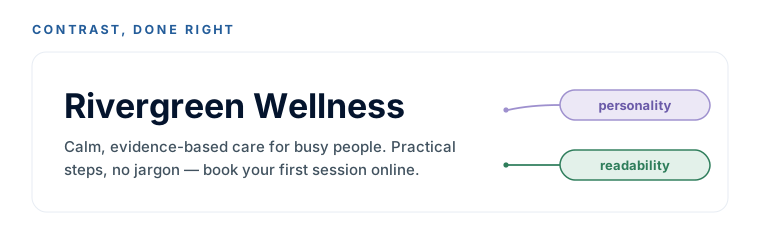
Here it is, the whole module in a sentence: one font carries personality, the other carries readability. Your heading font gets to have character. Your body font just has to be easy to read for paragraphs. Pick one of each and you’re done.
What makes a pairing feel designed rather than accidental is contrast between the two — a serif heading over a sans body, or a distinctive display font over a plain workhorse. Two fonts that are too similar look like a mistake; two with clear contrast look like a choice. One quiet trick: fonts with similar x-heights (the height of a lowercase ‘x’) feel like one system even when they contrast — but you don’t need to measure that; the tools below handle it for you.
Why Google Fonts, and only Google Fonts
We stay in one lane the whole module: Google Fonts(fonts.google.com). Two reasons, both practical. They’re free forever, no account, no licensing headaches. And the font names are exactly what a website build needs — hand over “Poppins” and “Inter” and everything downstream just works. Wander off into paid or system fonts and something breaks later. So: every tool we use outputs Google Fonts, on purpose.
Five can’t-go-wrong starters
If you’d rather not shuffle at all, pick one of these by vibe and stop — each is a professional-grade pairing, every font a free Google Font. Heading first, body second:
| Vibe | Heading | Body | Built for |
|---|---|---|---|
| Professional / trustworthy | Poppins SemiBold | Inter Regular | Consultants, finance, B2B |
| Warm / friendly | Fraunces Medium | Nunito Sans Regular | Wellness, local service, coaching |
| Modern / minimal | Space Grotesk Medium | Inter Regular | Tech, SaaS, design-forward |
| Bold / energetic | Archivo Black | Roboto Regular | Fitness, food trucks, events |
| Elegant / premium | Playfair Display | Lato Regular | Weddings, boutique, luxury |
These five are deliberately safe, not trendy. A beginner who picks any one and moves on has still landed a genuinely professional result. The next lessons are for finding something more you — but this is a real finish line, not a consolation prize.
Your Font Pairing Sheet
The AI pairing prompt, the verification gate, and these five starters all on one page — grab it and keep it beside you for the rest of the module.
DownloadYou can tell a serif from a sans, you know the one rule (personality font + readability font, with contrast), and you know we’re staying on Google Fonts. That’s all the theory there is. Now let’s go shuffling.
Watch this step
If you'd like the 'why' before the how, this is the clearest, jargon-free take on choosing fonts that actually work together — the one rule this lesson is built on. It’s from an independent creator — credited below, so go give them a follow.
The ULTIMATE Guide To Typography For Beginners
More learning resources
Still want another angle? These are hand-picked and vetted to line up with this lesson — from creators and sites worth your time.