Module 5 · Fonts That Look Chosen, Not Defaulted
Shuffle pairings until something clicks
Choosing fonts feels like it needs taste. It doesn’t — it needs a shuffle button and a shortlist. Two free tools do the taste for you: one lets you browse combos a pro already blessed, the other rerolls pairings until one clicks.
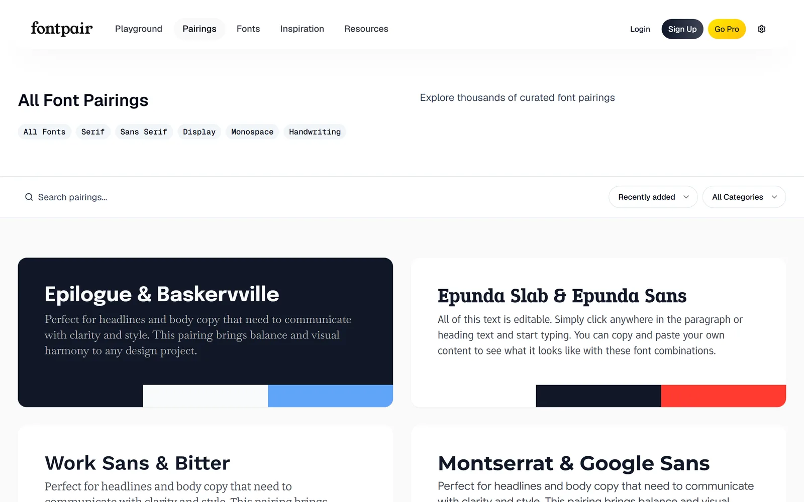
Fontpair: browse combos that already work
Start at fontpair.co. It’s 1,000+ hand-curated font pairings — every one already approved by a designer, every font on Google Fonts. You don’t judge whether a pairing is good; that’s handled. You just browse by category (Serif, Sans, Display, and so on) and notice which ones feel like you.
Fontjoy: the pure shuffle
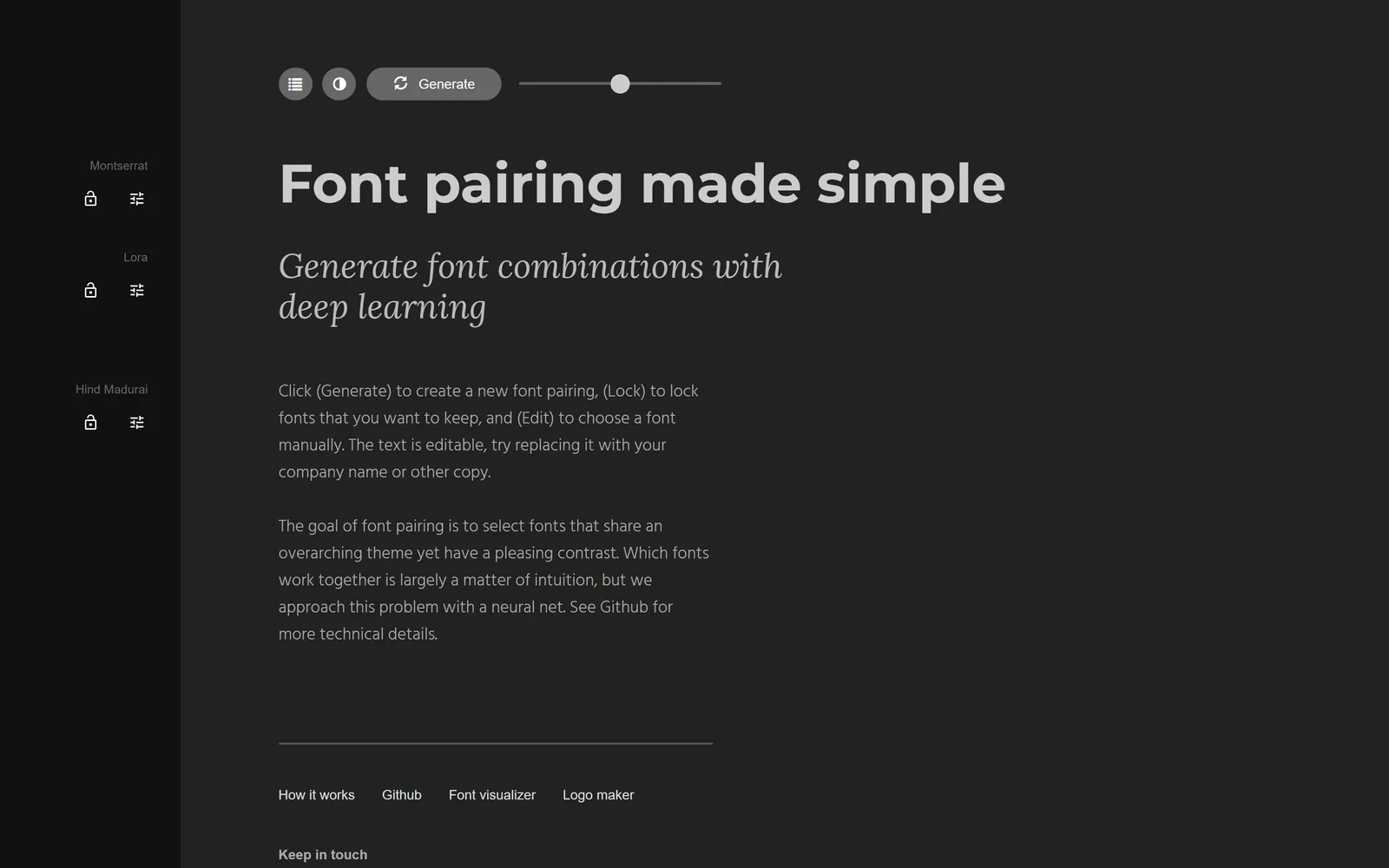
Now the addictive one: fontjoy.com. Free, no signup, all Google Fonts. It shows three stacked slots — heading, subheading, body — and one big button.
- Hit “Generate.” Every click swaps all the unlocked fonts for a fresh, algorithm-matched pairing. Keep clicking — it’s meant to be fast.
- Use the contrast slider. Low = the fonts feel similar; high = dramatic; medium is the sweet spot for most brands. Slide it and re-generate.
- Lock what you like. Click the padlock on a font you want to keep, then Generate again — it rerolls only the others. Found a heading you love? Lock it and shuffle for its body partner.
- Test your own words. Click the preview text and type your real business name or headline, so you’re judging the fonts on what you’ll actually use them for.
Build your shortlist
Your only job in this lesson: land on 3–4 pairings you’d be happy with, and write the names down (heading font + body font for each). Don’t agonise — a shortlist is meant to have options. You’ll narrow it with AI and a real test in the next two lessons.
Want to train your eye a little? Typewolf’s “40 Best Google Fonts”(typewolf.com/google-fonts) is a pro-curated list with real-world examples. It’s reading, not clicking — a reference for the curious, not a required step.
A written shortlist of 3–4 heading-and-body pairings, gathered by browsing and shuffling — zero taste required, zero dollars spent. Next we’ll ask AI for its picks and see if any overlap.
Everything looking fine but nothing exciting? Lock a heading font with real personality (a display or a characterful serif) and shuffle only the body — contrast is what makes a pairing feel intentional. Or jump back to Fontpair and steal a whole pairing outright; there are no points for doing it the hard way.
Watch this step
A brand-owner-friendly walkthrough of the same shuffle idea — browsing and generating pairings with free tools, no design background assumed. It’s from an independent creator — credited below, so go give them a follow.
What Is Font Pairing & How To Find The Perfect Font Pairing For Your Brand!
More learning resources
Still want another angle? These are hand-picked and vetted to line up with this lesson — from creators and sites worth your time.