
Module 4 · Colors You Can Defend
Lock the palette
You’ve got the colours. Now we make them official: name each one’s job, record the real hexes as the source of truth, and run one blunt AI critique to catch anything a beginner can’t see. Twelve minutes and your palette is locked.
Give every colour a job
A palette isn’t five nice colours — it’s five colours that each know their role. Write yours down like this, one line each:
| Role | What it does | Rule of thumb |
|---|---|---|
| Primary | Your main brand colour — what people picture | ~30% of the surface |
| Accent | Buttons and the one thing you want clicked | ~10% — scarce on purpose |
| Neutral-dark | Body text (rarely pure black — charcoal reads warmer) | Carries most of your words |
| Neutral-light | The background everything else lives on | ~60% — the quiet room |
Those percentages are the old 60-30-10 rule, and it’s worth a sentence: roughly, the neutrals do about 60% of the work, your primary about 30%, and the accent just 10% — the accent stays special precisely because it’s scarce. Splash it everywhere and it stops meaning “click here.”
Then add a one-line reason for each — “deep navy because the strategy says trustworthy and steady.” That sentence is what lets you defend the palette later.
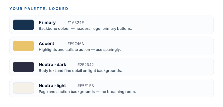
The source of truth = your Coolors hexes
Record the exact hex codes from your Coolors export. Not the AI image, not a screenshot — the copied hex values. These are the numbers that go in the brand book and into every future design decision.
Two mentor prompts before you lock
If you’re still torn between two palettes, use the hide-your-favourite trick — don’t tell the AI which one you like, or it’ll just flatter your choice:
Only if you're torn between two
Here are two color palettes for my brand (hex codes below). My brand strategy says it should feel [e.g. calm, trustworthy, premium] to [target customer]. Do NOT ask which I prefer and do NOT call both good — pick the ONE that better delivers that feeling and defend it in plain English. Then name the single weakest color in the winning palette and what you'd swap it for. Palette A: [hexes] Palette B: [hexes].
Then, whichever palette wins, run the practical sanity check — the stuff a business owner forgets until it’s printed:
Copy this into ChatGPT / Claude
For this palette [hexes], check the things a business owner forgets: Which text colors are actually readable on which background colors (flag any low-contrast pairs)? Which color should be the main/brand color vs. an accent used sparingly? Will any of these look cheap or clash when printed or on a phone screen? Be specific and blunt — I'd rather fix it now.
Treat the critique as a sharp second opinion, not a verdict. Trust the specific callouts (“your gold on cream fails contrast for body text”); ignore the vague filler. If a fix is a real readability problem, do it. If it’s a taste call, it’s yours to make.
Lock it and file it
Save your palette as a plain text file — roles, hexes, and rationale — and drop it into your Brand Package folder. This is a real deliverable now.
- Each colour has a role and a one-line reason.
- The exact Coolors hexes are recorded as the source of truth.
- You ran at least the sanity-check critique and fixed any readability flags.
- Saved as
brand-colors.txtin04-Colors-Fonts.
A locked palette you can defend in one sentence per colour, filed in your Brand Package folder. Your logo wears it, your future website will inherit it, and you never have to re-decide. Next up: fonts that look chosen, not defaulted.