
Module 2 · Your Logo, Part 1: Find "The One"
How AI logo generation actually works
Before you generate a single logo, five minutes of expectation-setting will save you an afternoon of frustration. This lesson is the “how the machine actually works” briefing: what AI is genuinely good at for logos in 2026, the one rule that quietly decides whether your logo turns into a clean file later, and an honest word on those $65 logo makers you’ll see the second you Google “logo maker.”
What AI is good at now — and the one thing it still isn’t
The image model you’ll use (ChatGPT’s — GPT Image 2, the version it shipped in 2026) is a different animal from the ones that earned AI its patchy reputation a year ago. It follows edit instructions faithfully, and — the big one — it changes only what you ask it to, keeping the rest of the image steady. That single upgrade is what makes the “feed it back, ask for a tweak” loop in the next lessons actually work.
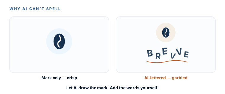
The weak spot that hasn’t gone away: text inside logos still garbles.Ask for “Riverside Dental” across the bottom and you’ll often get “Rivrside Dentl” in a font nobody chose. So here’s the working rule for this whole module: go for an icon or symbol mark, and add your business name in a real font later — that’s a whole module of its own (fonts, m5). If the name genuinely has to live inside the logo, that’s exactly what Ideogram is for (your escape hatch from the toolkit lesson).
Three kinds of logo (so you know your lane)
“Logo” isn’t one thing. There are three shapes it can take, and knowing them decides how you prompt — including the honest answer to “what if I don’t want an icon at all?”
Icon / symbol mark
A standalone shape. Best for AI generation — the text lives in a real font. This is the course default.
Wordmark
Your name IS the logo, set in a distinctive font. You can build this in Module 5 with zero image generation.
Combination mark
Icon and name locked together. Make the icon here, marry it to your font later — you get both layouts free.
Everything in this module uses ChatGPT as the single spine — one tool, less to learn. But two free stand-ins take the exact same prompts if you hit ChatGPT’s daily image limit or need clean text in the mark: Ideogram 3.0 (ideogram.ai — the best tool anywhere at spelling words correctly inside a logo) and Google Gemini(gemini.google.com — free, excellent quality). Same prompts, different window.
The sticker rule (learn this before you prompt anything)
Here is the most valuable sentence in the whole logo section, and it costs you nothing to remember:
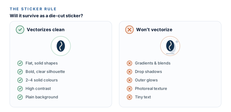
“If it looks like a sticker — flat, bold, few colors, crisp edges — it’ll vectorize in one click. If it looks like a photograph or a painting, it won’t.”
Here’s the why, in plain English. In the next module you’ll turn your logo into a proper scalable file (an SVG). The tool that does that traces flat shapes and solid color areas. Give it a flat, bold, sticker-like mark and it traces cleanly in seconds. Give it gradients, drop shadows, soft glows, or photo-real texture and it chokes — you get jagged, muddy, or bloated results. So you make that job easy by prompting for the right thing from the very first image.
What to ask for — and what to steer clear of:
- Ask for: flat, simple, modern, vector-style, solid colors, high contrast, clean line art, plain background.
- Keep it to 2–4 colors. Fewer colors trace cleaner and stay easier to work with.
- Avoid: gradients, shadows, glows, 3D, photoreal texture, and lots of small text.
Get the sticker rule right and Module 3 becomes almost foolproof — a clean click, a clean file. Ignore it and you’ll be back here re-generating. It’s the single change that makes everything downstream easy, so we teach it first, before you’ve made anything to get attached to.
The honest word on $65 logo makers
Google “logo maker” and you’ll hit Looka, Brandmark, Tailor Brands and friends on page one. We’re not going to pretend they don’t exist. Here’s the straight version.
What they are: template-assembly engines. They snap a professional vector icon from a shared library onto a professional font. That’s why the result is instantly clean — and also why so many of them end up looking like cousins of each other.
When a mill is genuinely fine — and we’ll say so plainly:
- You value ten minutes over a one-of-a-kind mark, and you’re happy to pay once. Brandmark ($35 one-time) is the cleanest buy and the best logo quality of the bunch; Looka ($65) gives the fullest brand kit. Both hand you a real, clean SVG.
The two traps to dodge:
- The bait tier. The cheapest plan (Looka $20, LogoAI $29) usually gives you a PNG and no vector file — you’ll pay more than the sticker price to actually leave with what you need.
- The subscription hostage. Tailor Brands and others are recurring — cancel and you can lose access to your own assets. Prefer one-time over monthly, always.
So why are we teaching the AI loop instead? Three reasons: it’s distinctive(you escape the template), it’s $0, and the skill you build — describe, look, refine, critique — transfers to your colors, your fonts, your mockups, and everything else this weekend. A mill hands you one logo and nothing else. The loop hands you a skill.
Paid logo mill
- 10 minutes, one-time fee
- Instantly clean — it’s template assembly
- Can look like its template cousins
- Watch the bait tier: the cheapest plan often has no vector file
The AI loop (this course)
- $0
- Distinctive — you steer the search
- Teaches a skill you reuse on colours, fonts, and mockups
- A weekend habit, not a purchase
Pull your brand words before you start
One last bit of prep. Open the brand strategy document you built in Module 1 and find your answers to Q13 and Q14 — your five brand words and the feeling you want the brand to give. Those adjectives are about to become the fuel for every logo prompt. You’re not starting from a blank page; you’re starting from your own strategy.
You know what AI can and can’t do for a logo, you’ve got the sticker rule in your back pocket, you know when a paid mill is a fair shortcut (and when it’s a trap), and your brand words are ready. Next: generate 40–60 directions in the time it takes to make a coffee.
Watch this step
Before the theory, here's the whole thing done in five easy minutes — a calm, zero-jargon logo build in ChatGPT that proves it really is this simple. It’s from an independent creator — credited below, so go give them a follow.
ChatGPT Image Generator Tutorial (Exact Prompts I Use)
More learning resources
Still want another angle? These are hand-picked and vetted to line up with this lesson — from creators and sites worth your time.