
Module 4 · Colors You Can Defend
See it before you marry it
Colours that look great as five tidy columns can fall apart the moment there’s text on them. This lesson is the honest mirror: you’ll see your exacthexes on a real page, check they’re actually readable, and get a feel for the vibe — before you commit.
Realtime Colors: your exact hexes on a real page
Go to realtimecolors.com. It’s 100% free (the pricing page is a tongue-in-cheek “$0.00/mo”), and it drops your palette onto a live one-page website mockup instantly. Because it uses your real hex values — not repainted pixels — this is the truth, in context.
- Open
realtimecolors.com. A sample site appears with default colours. - Find the colour controls (the swatches at the bottom / in the panel). Click each one and paste in an exact hex from your Coolors export — text, background, primary, accent.
- Watch the whole page recolour live. This is your palette doing its actual job: headings, body text, a button, backgrounds.
- Use the built-in contrast check. If it warns you that your text-on-background is hard to read, believe it — readable text is non-negotiable, and it’s the mistake beginners make most.
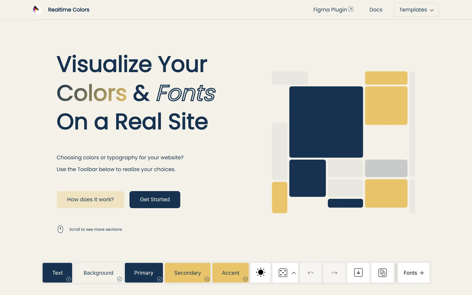
Realtime Colors also previews fonts. You’ll ignore that for now, but notice it — it’s a preview of the exact next thing you’ll choose, and a preview of your eventual website.
AI mockups: for vibe, not for measuring
Realtime Colors shows you the truth. AI mockups show you the vibe — how your palette feels with a photo, an icon, a real headline. Both are useful; they just answer different questions. Upload nothing — just describe it:
Copy this into ChatGPT / Gemini
Create a realistic website hero-section mockup for my brand using ONLY these colors: Primary [#hex], Accent [#hex], Text [#hex], Background [#hex]. Show a headline, a subheading, one call-to-action button, a simple icon or two, and a placeholder photo area — so I can see how the palette feels with text, icons, and photography together. Clean, modern, flat. Use the accent color for the button.
Then spin it onto other surfaces, one at a time, to pressure-test the feeling:
- “…now show the same palette as a business-card / brand-display mockup.”
- “…as a social-media post template.”
- “…with a photograph in the hero so I can see the palette against real imagery.”
See your logo in the wild
Want the fun part? No new tool required — it’s just a prompt. Attach your logo and ask the AI to stage it in the real world:
Copy this into ChatGPT / Gemini
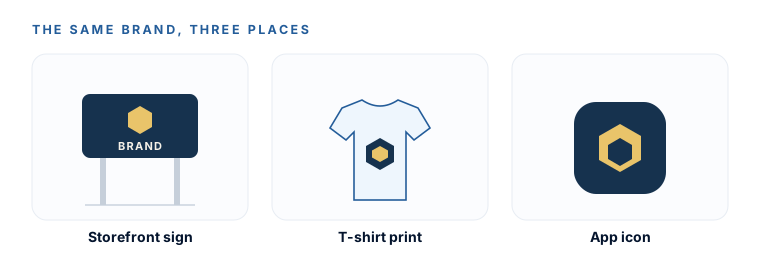
Show my logo and these colors on a storefront sign, a t-shirt, and a phone app icon so I can see how they'd look in the real world.
It won’t be pixel-accurate, but it’s a genuinely useful gut-check: does the brand hold up on a sign at a distance? On fabric? Squished into an app icon?
Trust the text hex codes the AI writes, never the colours it paints.AI images judge feel. Coolors hexes are the source of truth. Realtime Colors shows the truth in context. If an AI mockup’s colour looks slightly off from your hex, the mockup is wrong, not your palette — never eyedrop a “final” colour out of a generated image.
You’ve seen your exact palette on a real layout in Realtime Colors, confirmed your text is readable, and felt the vibe on a mockup or two. You either love it — or you spotted a weak colour and know to go fix it in Coolors. Either way, no nasty surprises later.
Watch this step
This is Realtime Colors explained by the person who built it — the clearest tour of applying your real hexes to a live page and reading the contrast check. It’s from an independent creator — credited below, so go give them a follow.
I made the best way to choose colors for UI design - Realtime Colors v1
More learning resources
Still want another angle? These are hand-picked and vetted to line up with this lesson — from creators and sites worth your time.