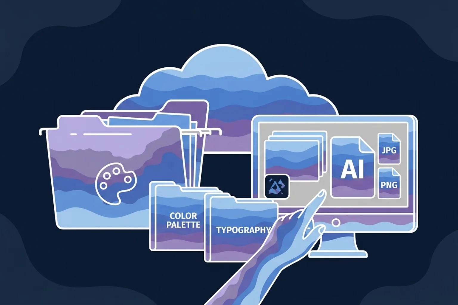
Module 3 · Your Logo, Part 2: Production Files (No Editor Required)
The file kit every business needs
A logo isn’t one file — it’s a small kit. This lesson gives you the one mental model that makes file formats click, the five files every business actually reaches for, a favicon in three clicks, and the Brand Package folder you’ll fill for the rest of the course. By the weekend’s end, it assembles itself.
The only idea you need: pixels vs. math
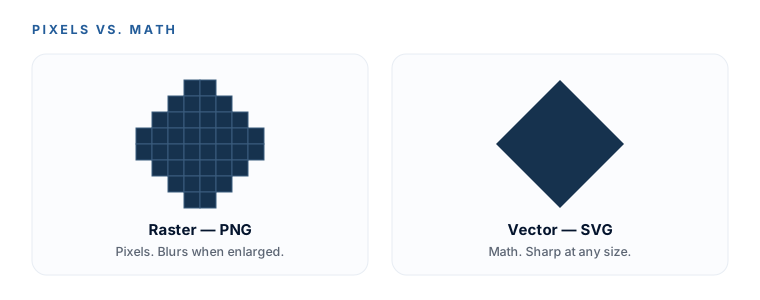
Forget the acronyms for a second. There are two kinds of image in the world:
- Raster = made of pixels (a grid of colored dots). Blow it up past its size and you see the dots — it goes blurry. PNG and JPG are raster.
- Vector = made of math (points and curves). It redraws itself at any size, so it’s razor-sharp on a favicon and a billboard, and the file is tiny. SVG is vector.
Three formats hang off that, one line of “when” each:
- PNG — raster, transparent-capable. Your everyday workhorse: drop it onto websites, slides, posts, email signatures.
- SVG — vector, infinitely scalable, tiny. Your master / source of truth. Everything else exports from it.
- JPG — raster, always a solid background. For photos only — it bakes a white box behind a logo and blurs sharp edges. Avoid for logos.
Why the transparent SVG is the crown jewel: it scales from favicon to billboard with zero quality loss, carries no background so it drops onto anything, and is the one file a designer, a printer, or an AI can produce everything else from. Guard it.
The 5-file kit every business needs
| File | Format | Size | You’ll use it for |
|---|---|---|---|
| Master logo | SVG, transparent | Any size | Website, print — everything |
| Everyday logo | PNG, transparent | ~1000–2000px wide | The one you’ll paste most |
| Social avatar | PNG | 800×800 square | Every profile picture |
| Favicon set | ICO + PNGs | From favicon.io | The tiny browser-tab icon |
| On-dark version | SVG + PNG, white | Matches the master | Surviving on dark backgrounds |
The same five, with the one caveat that matters on each:
- Master logo — SVG, transparent. Scales forever. Website, print, anything.
- Everyday logo — transparent PNG, exported ~1000–2000px wide. The one you’ll paste most.
- Social avatar — a square 800×800 PNG. One size covers every platform: they all store a big square and crop it to a circle. Center the mark, leave breathing room around it, and use the mark only — wordmarks turn to mush at avatar size.
- Favicon set — the tiny browser-tab icon (next section).
- On-dark version — the white version of your logo, PNG + SVG, so it survives on dark backgrounds.
Need the PNG resizes? Just ask ChatGPT (“give me this logo as a transparent PNG, 800×800, mark centered with breathing room”) or resize in the free editing tools from Module 6. No editor required here either.
Your favicon, in three clicks
A favicon is the little icon in the browser tab and bookmarks. It has to be square, simple, and ideally transparent — intricate logos turn to mush at 16×16, so use your mark, not the full logo with text.
- Go to
favicon.io/favicon-converter. - Upload your square mark PNG.
- Download the ZIP — it contains the
favicon.icoplus every size you need.
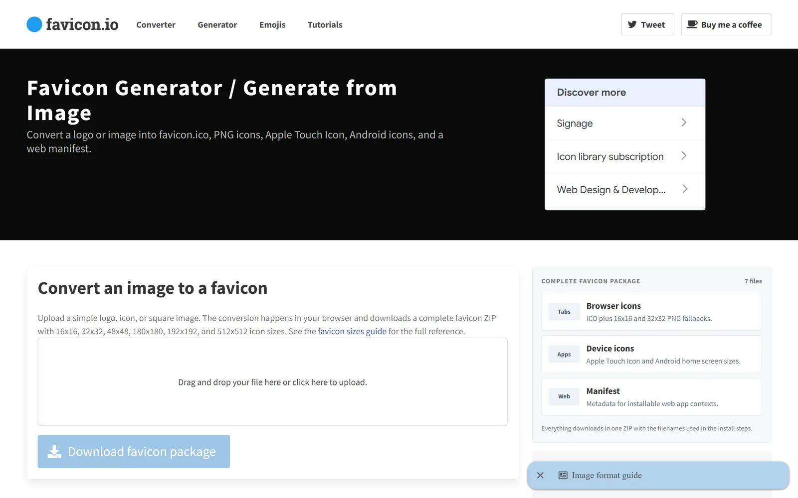
Use realfavicongenerator.net instead — same idea, but it previews the icon in a browser tab, on iOS and on Android, and hands you the exact HTML to paste into your site’s <head>. Both tools are free; favicon.io is the fewest clicks, RealFaviconGenerator is the thorough one.
Lockups: one that matters, the rest optional
A lockup is a fixed arrangement of your mark and your name — horizontal (mark beside the text) or stacked (mark above the text). You don’t need to fuss over formal lockups. The one variation that genuinely earns its place is the mark-only version — it’s your social avatar and your favicon source, and you already made it.
Want the stacked and horizontal versions too? They’re a single optional prompt — no editor, on-brand with everything else you’ve done:
Optional — copy this into ChatGPT
Using this exact logo, give me a stacked version with the icon centered above the
business name, and a horizontal version with the icon to the left of the name —
transparent background, same colors and font.
“Send a vector file” → send your SVG (or export a PDF). Both are vector and print sharp at any size. “RGB or CMYK?”→ screens are RGB (light), printers are CMYK (ink); your brand hexes are RGB. Hand the printer the vector/PDF and let them convert, or ask them to match your hexes. Very bright, neon colors print slightly duller — that’s normal, not a mistake.
Set up your Brand Package folder
This is the folder that becomes your whole brand — and by Module 7 it assembles itself, because each module drops its file into the right slot. Make it now:
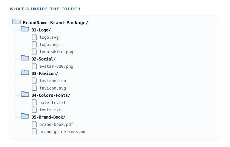
Your folder structure
BrandName-Brand-Package/
├─ 01-Logo/
│  ├─ brandname-logo-full-color.svg        ← master (crown jewel)
│  ├─ brandname-logo-full-color.png        ← transparent, everyday use
│  ├─ brandname-logo-white.svg / .png      ← for dark backgrounds
│  ├─ brandname-mark-only.svg / .png       ← the icon alone (avatars, favicon source)
│  └─ brandname-logo-print.pdf             ← hand to a printer
├─ 02-Social/
│  └─ brandname-avatar-800.png             ← 800×800 square profile picture
├─ 03-Favicon/
│  └─ (the ZIP from favicon.io, unzipped)
├─ 04-Colors-Fonts/
│  ├─ brand-colors.txt                     ← the hex codes (from m4)
│  └─ fonts-and-links.txt                  ← Google Font names + links (from m5)
└─ 05-Brand-Book/
   ├─ brand-book.pdf                        ← the pretty version (from m7)
   └─ brand-book.md                         ← the AI-pasteable text version (from m7)
Naming rule: brandname-whatitis-variant.ext — all lowercase, dashes not spaces (e.g. acme-logo-white.svg). Spaces break things when files get shared or used on the web; a descriptive name means you’ll always know what a file is without opening it. One growth tip: add the year if you ever refresh the brand.
You understand formats in one mental model, your 5-file kit and favicon are saved, and your Brand Package folder exists with today’s logo files already dropped into 01-Logo. Your logo is done — files and all. Next session: colors you can defend.
See what your current site says about your brand.
Your brand is about to be sharper than your website. The free Website Conversion Grader scores the site you have today in three minutes — so you know exactly what the refresh has to fix.
Watch this step
The format explainer on screen — each logo file type and exactly when to reach for it — mapping straight onto the pixels-vs-math model in this lesson. It’s from an independent creator — credited below, so go give them a follow.
2 Kinds of Digital Art: Vector vs Raster
More learning resources
Still want another angle? These are hand-picked and vetted to line up with this lesson — from creators and sites worth your time.